The Archival Standard: A Professional Guide to Pet Portrait Materials
After nearly three decades creating pet portraits professionally, we have learned something very simple. Quality is often invisible until it is not.
By Melanie Phillips and Nicholas Beall
Professional Pet Portrait Artists | Established 1996
In this guide we cover
- Why the choice of paper and canvas affects how long your portrait lasts
- The graphite pencils I use for detailed pencil portraits and why I use a range rather than just one
- The Arches Aquarelle paper I switched to and why it matters for archival quality
- The oil paints and linen canvas Nicholas uses and what makes them professionally reliable
- Why cheap materials look fine initially but often fail over time
This guide is not here to overwhelm you with technical talk. It exists because clients deserve to know what professional standards actually look like — and because the materials behind a portrait matter far more than most people realise when they first start researching commissions.
Many people do not realise that cheaper paper can yellow and become brittle over time, or that low-quality paints can fade and shift far sooner than expected. That is why we do not compromise on materials. When a client entrusts us with a cherished memory, our job is not only to capture a likeness, but to create an artwork designed to last for decades — and ideally much longer than that.
Below I will walk you through exactly what we use in our studio and why. I create all graphite pencil portraits and Nicholas paints all oil portraits. Different mediums need different approaches, but the goal is always the same — a portrait that still looks wonderful decades from now.
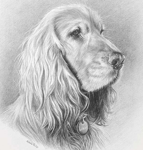
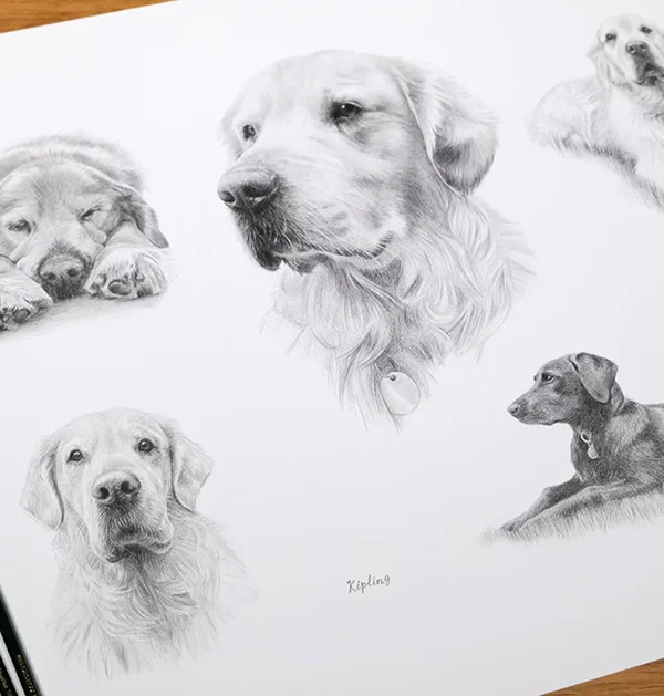
Melanie's Pencil Portraits: Graphite on Paper
In professional graphite work, the relationship between pencil and paper matters more than most people expect. If the surface fights you, the detail suffers. If the pencil quality is inconsistent, you end up battling the material instead of drawing. To capture the things clients care about most — the expression, the softness of fur, the tiny highlight in an eye — both need to work together perfectly.
After many years of testing and refining, I now work with a small range of professional graphite pencils rather than just one. Each brand has its own character and I reach for different ones at different stages of a portrait. It gives me control over tone, detail and texture that a single pencil simply cannot provide.
What I look for in a professional pencil
- Smooth, consistent lay-down: no gritty patches or hard spots that interrupt fine fur detail
- A proper tonal range: from crisp light grades for whiskers and highlights to deep soft grades for rich shadows
- Reliable point retention: they need to sharpen well and hold a fine point, which is essential for precise portrait work
- Predictable behaviour: consistency across grades so there are no surprises mid-drawing
The Pencils I Use
I am always mixing and matching pencils depending on the commission, the pet and the stage of the drawing. After nearly thirty years, I am still experimenting and refining — which I think is part of what keeps the work feeling fresh. Here are the pencils currently in my studio toolkit.
Faber-Castell 9000 — My Go-To
The Faber-Castell 9000s are the green pencils you will almost always find on my desk and they are my absolute favourite. They have a slightly firmer feel and produce light, beautifully controlled tones. I find them particularly useful for gentle shading, subtle transitions and areas where I want precise control without the graphite becoming heavy too quickly. They hold a fine point exceptionally well, which makes them ideal for crisp hair and whisker detail, clean edges and delicate highlights. If I could only use one pencil, it would be these.
 Faber-Castell 9000 my go-to graphite pencils
Staedtler Mars Lumograph
The Staedtler Mars Lumograph pencils run a little softer and darker in equivalent grades. These are invaluable for building mid-tones and deeper shadows within a portrait. They have a smooth, almost velvety feel on the paper, which allows for an even lay-down of tone and the rich, deep darks that give a portrait proper depth and contrast.
 Staedtler Mars Lumograph excellent for rich darks
Derwent Graphic
I use Derwent Graphic pencils alongside my Faber-Castell and Staedtler ranges. They sit nicely between the two in terms of feel — useful for general drawing, early blocking in and establishing overall structure before the finer layers go down. They are great for building even mid-tones across larger areas of fur. I will be honest and say I occasionally find the odd scratchy bit in the lead, which can be a little irritating, but otherwise they are a solid, reliable pencil.
 Derwent Graphic reliable for blocking in
Tombow Mono 100
I have more recently added Tombow Mono 100 pencils to my toolkit and I have been really impressed. They are on the harder end of the scale, which makes them excellent for precise, fine detail work. The lay-down is noticeably smooth and consistent, and they hold a sharp point beautifully. I find them particularly useful when I need clean, controlled marks for intricate fur texture or fine whisker detail. A lovely pencil.
 Tombow Mono 100 smooth and perfect for fine detail
Koh-I-Noor Graphite Pencils
I have also been experimenting with Koh-I-Noor graphite pencils, which are another harder pencil and useful for detailed work. I am still putting them through their paces if I am honest — they can occasionally feel a little scratchy compared to the Tombows, but I am finding where they work best in my process. Part of working professionally is always being willing to test and refine, and these are still being evaluated.
Having a range of pencil types means I can use whatever the drawing needs at each stage rather than forcing one pencil to do everything. It gives me control over the full tonal range of a portrait and helps keep the finished work feeling natural, detailed and well balanced.
 Koh-I-Noor — currently being put through their paces
The Paper: Arches Aquarelle Hot Pressed
Paper is one of the most important choices in graphite portraiture. The surface plays a major role in how much detail can be achieved, how the pencil behaves, and how well the finished drawing ages over time. The wrong paper can dull detail, fight the pencil, or deteriorate long before it should. The right paper supports the work beautifully and protects it for generations.
After testing several professional papers over the years, I now use Arches Aquarelle Watercolour Paper — Hot Pressed (Smooth), 300gsm, made in France. Although Arches is perhaps best known as a watercolour paper, the Hot Pressed surface — which means smooth rather than textured — is outstanding for detailed graphite work. The pencil glides cleanly and predictably, which is exactly what you need when building up fine layers of fur, subtle tonal transitions and precise detail.
- Hot Pressed (smooth) surface: allows graphite to lay down evenly and cleanly without the pencil catching on unwanted texture, essential for detailed portrait work
- 300gsm weight: substantial and stable under multiple layers of graphite and careful lifting without any surface damage
- 100% cotton fibre: naturally acid-free and far more stable over time than wood-pulp papers, which contain lignin and can yellow or weaken
- No OBAs (Optical Brightening Agents): many cheaper papers use optical brighteners to appear white initially, but these break down over time and cause yellowing. Arches contains none, so the paper remains naturally stable and bright
- Archival quality: made in France to museum standards, designed to remain stable for generations when framed and cared for correctly
- Naturally white: a clean, consistent tone that works beautifully as the lightest lights in a graphite portrait
The difference between archival paper and standard paper is not something you see on day one. It is something you see in ten, twenty or fifty years. A portrait drawn on quality cotton paper, properly framed, should still look exactly as it does today long after we are all gone. That is what we mean when we talk about creating work that lasts.
 Arches Aquarelle Hot Pressed Paper
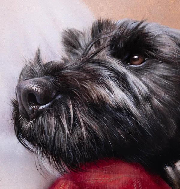
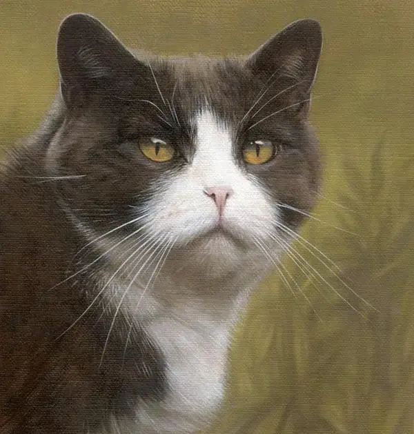
Nicholas's Oil Paintings: Paints and Canvas
Oil is a traditional medium, but modern professional standards have moved on a long way from the studios of previous centuries. Done properly, oil paint has a depth, richness and warmth that is very hard to match in any other medium. Done poorly — with low-grade paints or unstable surfaces — it can crack, dull, or yellow over time. Materials and technique both matter enormously.
Nicholas uses Winsor & Newton Artisan water mixable oils and paints on Winsor & Newton Classic Linen Canvas, professionally prepared and stretched. These choices are not about brand names or convenience. They are about stability, longevity, and creating a paint film that cures well and stands the test of time.
Why Nicholas Uses Winsor & Newton Water Mixable Oils
The term "water mixable" can sound like a compromise if you have not come across it before. It is not. These are genuine, professional-grade oil paints, made with modified drying oils so they can be thinned and cleaned with water rather than relying on traditional solvents. The pigment quality, colour depth and painting behaviour are those of proper oils.
For a professional studio like ours, where we both work in the same space every day, this matters for practical, health and environmental reasons. It allows Nicholas to work in a cleaner, safer environment and significantly reduces the need for strong solvents. And it means I can sit at my drawing desk two metres away without breathing turpentine fumes all day, which I am very grateful for!
- Genuine oil paint behaviour: professional feel and pigment performance, not watercolour or acrylic
- Reduced solvent use: far less dependence on turpentine or white spirit, which is better for health and the studio environment
- Colour longevity: Nicholas selects colours with strong permanence and lightfastness ratings so the portrait remains rich and true over time
- Careful use of mediums: oil painting relies on controlled layering; Nicholas uses appropriate mediums to manage flow, gloss and drying at each stage
The goal is always a stable, long-lasting paint film and a portrait that ages gracefully rather than deteriorating. That is what professional materials are for.
 Winsor and Newton Oil Paints
The Foundation: Why Linen Canvas Makes a Difference
In oil painting, the surface beneath the paint matters just as much as the paint itself. Oil paint cures and hardens over time, and it needs a stable, strong foundation beneath it. If the canvas is too flexible or poorly prepared, the paint surface can develop problems over the years.
Nicholas paints on Winsor & Newton Classic Linen Canvas, professionally prepared and stretched. Linen has been the preferred support for serious oil painting for centuries, and with good reason.
- Linen versus cotton: linen is significantly stronger and more dimensionally stable than standard cotton canvas, making it the professional choice for work intended to last
- Fine, even weave: allows for controlled, detailed brushwork and the kind of precise fur texture that Nicholas's portraits require
- Professional priming: creates a proper barrier between the oil paint and the fabric, protecting both the surface and the paint film
- Factory stretched: maintains consistent tension and structural integrity over time
By combining high-quality linen with professional oil paints and careful, disciplined technique, Nicholas is building paintings that are intended to age gracefully — portraits that should look just as rich and vibrant in fifty years as they do the day they arrive.
 Winsor and Newton linen canvas for Nicholas Beall's oil pet portraits
Nicholas's Brushes
Brushes are one of those things that look simple from the outside but make an enormous difference to how a painting develops. Nicholas works with two trusted ranges, both in filbert shapes — that distinctive rounded oval tip that is perfectly suited to oil portrait work. A filbert follows the natural curves of a face and body, blends softly at the edges and allows for both precise marks and sweeping strokes depending on how it is held and loaded with paint.
Da Vinci Nova Series 1875 — Synthetic Filberts
Nicholas uses the Da Vinci Nova Series 1875 filbert brushes in sizes 1 and 2, sourced from Jackson's Art Supplies. These are professional-grade synthetic brushes made in Germany, blending three different diameters of synthetic fibre to carry paint smoothly and evenly. They are versatile enough to handle both broader areas of the painting and fine detail work — Nicholas reaches for these throughout a commission rather than just at one stage. They hold their shape well, clean easily and are consistently reliable across a long working session.
Rosemary's Shiraz Short Filberts
Alongside the Da Vincis, Nicholas uses Rosemary's Shiraz Short Filbert brushes in sizes 1 through 4. Rosemary & Co are a small, highly regarded British brush maker and their Shiraz range is made with a synthetic filbert head on a short handle — which suits the controlled, close work of portrait painting particularly well. Nicholas uses these for detail work, where the shorter handle gives extra precision and control. Rosemary's brushes are something of a favourite among professional painters and it is easy to see why.
Winsor & Newton Retouching Varnish
Also worth mentioning is the Winsor & Newton Retouching Varnish that Nicholas uses during the painting process. As oil paint dries it can temporarily lose some of its depth and richness in certain areas — a phenomenon known as "sinking in". Retouching varnish restores that surface depth and allows Nicholas to see the true colour relationships in the painting while he works, ensuring the finished portrait looks as rich and consistent as intended.
 Nicholas's brushes — Da Vinci Nova and Rosemary's Shiraz filberts
Why These Choices Matter to You
We are not choosing these materials to sound impressive or to justify our pricing. We choose them because they work, and because the portraits we create are not decorative items with a short shelf life. They are keepsakes, memorials and heirlooms — and the materials need to match that intention.
Cheap materials often look perfectly fine when a portrait is new. The problems appear later: paper yellows and becomes brittle, paint surfaces dull or crack, colours shift. Professional, archival-grade materials are chosen specifically to reduce those risks and to support the long-term life of the artwork.
If you are commissioning a portrait as a gift, a memorial, or simply something you hope to keep forever, this is exactly where professional standards matter. It is about accountability. When someone trusts us with the memory of their pet, the least we can do is make sure the materials are worthy of that trust.
Interested in commissioning a portrait? Now you know what goes into the materials, you might like to explore our prices and commission information or read our in-depth pricing guide to understand what sits behind the cost of a professional portrait.
Frequently Asked Questions About Pet Portrait Materials
Paper is the foundation of a pencil portrait. The surface texture affects how much detail is possible, how the pencil behaves across different grades, and how well the drawing ages. Poor paper — particularly wood-pulp paper containing lignin — can yellow, become brittle and degrade over time. Archival cotton paper like Arches Aquarelle is acid-free, contains no optical brighteners and is designed to remain stable for generations. The portrait may look similar on day one regardless of the paper, but the difference becomes very apparent over decades.
OBAs are Optical Brightening Agents — chemicals added to many papers and fabrics to make them appear brighter and whiter than they naturally are. They work by absorbing UV light and re-emitting it as visible light. The problem is that OBAs break down over time, especially when exposed to light, and as they degrade the paper can begin to yellow. Arches paper is naturally white and contains no OBAs, which means its brightness is genuine and stable rather than artificially enhanced. For archival artwork this is an important quality consideration.
Different pencil brands have genuinely different characteristics — different degrees of hardness and softness within the same grade, different feels on the paper, different strengths at holding a fine point. Using a range means I can choose the right pencil for each stage of a portrait. A harder pencil might be better for fine whisker detail while a softer one builds richer shadows. Forcing one pencil to do everything limits control. After nearly thirty years of drawing, mixing and matching is simply how I work best.
For professional, archival-quality oil painting, linen is widely regarded as the superior support. It is stronger than cotton, more dimensionally stable — meaning it moves less with changes in humidity and temperature — and has a finer, more even weave that suits detailed work. Cotton canvas is perfectly adequate for many purposes, but when the goal is a portrait intended to last for generations, linen is the professional choice. Nicholas has always worked on linen for exactly this reason.
Yes, when made to professional standard they are. Winsor & Newton Artisan water mixable oils are genuine oil paints — not watercolour or acrylic. They behave like traditional oils in terms of blending, layering and drying, but use modified drying oils that allow water to be used for thinning and cleaning rather than solvents. The pigment quality, colour permanence and paint film characteristics are those of professional-grade oils. The main benefit for our studio is health and practicality — significantly less reliance on strong solvents while maintaining all the qualities of traditional oil painting.
We include a care leaflet with every portrait. The key principles are: keep the portrait away from direct sunlight and strong artificial UV light, avoid hanging in very damp or humid rooms such as bathrooms, and frame pencil portraits behind UV-protective glass. Pencil portraits should always be framed under glass with a mount to keep the surface away from the glass itself. Oil paintings do not need glass but benefit from occasional gentle dusting and should be kept away from excessive moisture. You can read more on our Care & Framing page.